
A Brief Manuscript Formatting Checklist
If all you need to do is review the basics, our handy formatting checklist is here to help.
read
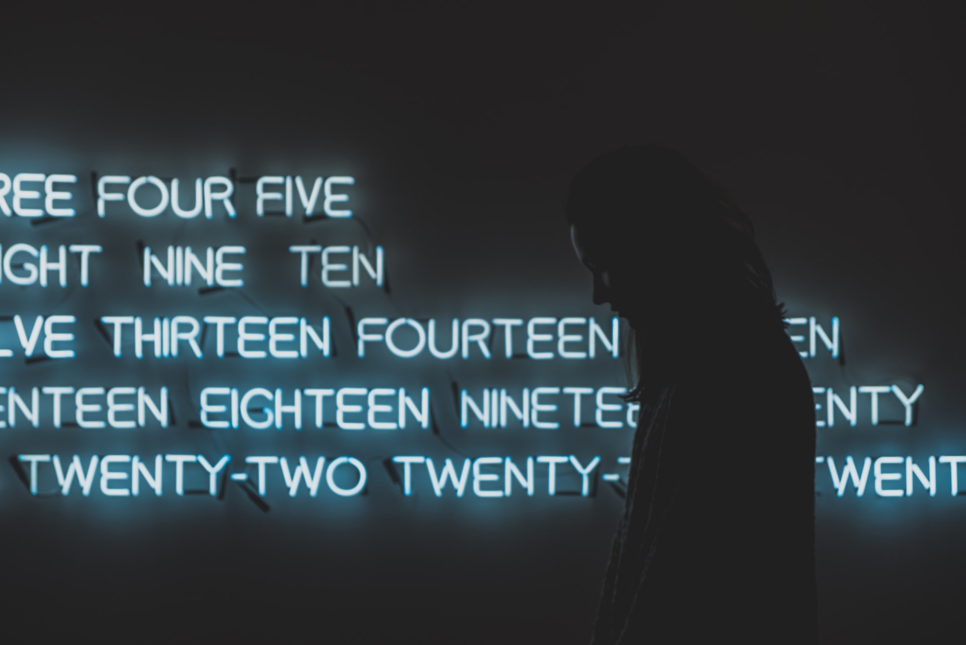
My 2¢ (Two Cents?) on Spelling Out Numbers in Text
The question of when and how to use numerals in your manuscript is a complicated one, no 2 ways about it. Wait, 2? Two? Let’s dive into these murky waters and try to find some clarity.
read
The Old Rule of Thumb for Estimating Word Count Is Obsolete
In days of yore, the accepted rule for estimating word count was 250 words per manuscript page. Is that still the case today? If not, how should it be done instead?
read

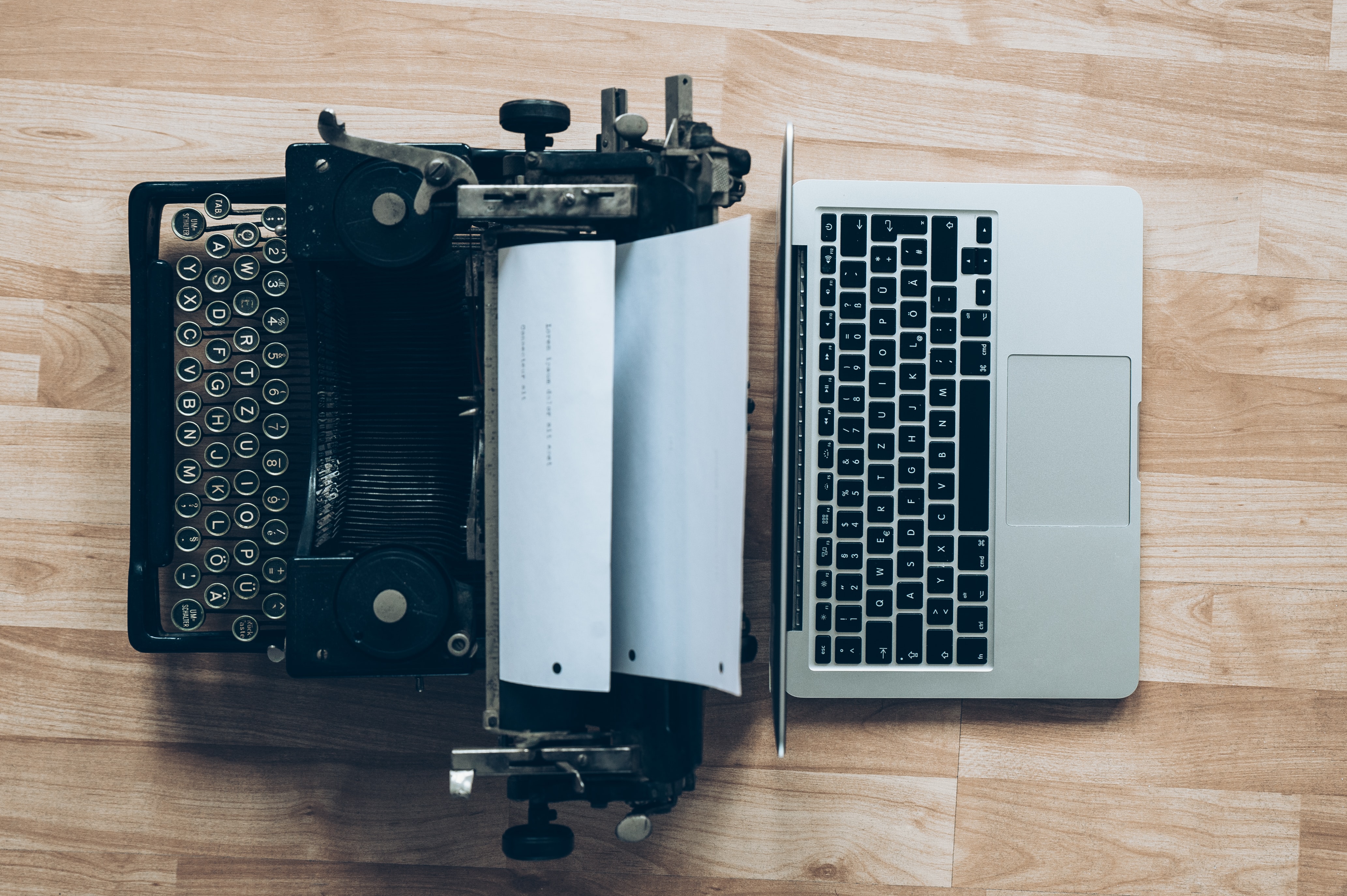
The First Paragraph of Your Manuscript Should Look Like Any Other
When it comes to indentation, keeps things as simple and uniform as possible. Don’t take your cues from the way published books look.
read

To Pronoun or Not to Pronoun: That Is the Initial Question
Is it mandatory to include one’s personal pronouns on a manuscript submission? And is it acceptable to obscure one’s gender when submitting to certain publications?
read
“Proper Manuscript Format” Now Comes in Two Distinct Flavors
The latest update to the popular manuscript preparation guide can be viewed in either “Modern” or “Classic” format.
read

Indenting Paragraphs Without the Tab Key
Set up paragraph styles in your word processor to handle pesky tasks like indentation. Your editor and her staff will thank you for it.
read
When a Sentence Doesn't End with a Period
A reader writes to ask: I know it’s still acceptable to space twice after periods. However, if there’s a close quote after a period is there actually only one space remaining after the quotation mark before first letter of the...
read
How to Format a Poetry Collection
A reader writes to ask: I am currently trying to put together a manuscript of all of my late mother's poetry that she wrote from about 1970 to 2013, when she passed away. I made her a promise that when...
read
Proper Paper Size for Manuscript Submissions
A reader writes to ask: I have just one question concerning the "1in from margin" factor: what page size is normally used? 8.5x11? 6x9 ? I see the '1in from margin' statement everywhere but nowhere I've found do they say...
read